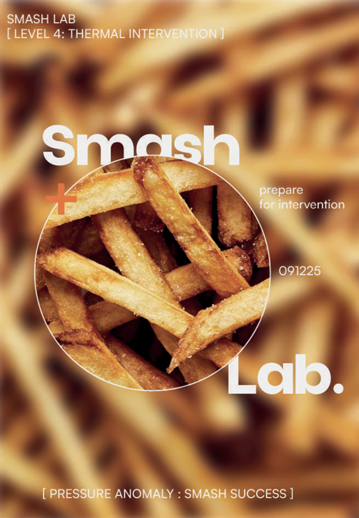
SMASH LAB RESTAURANT IDENTITY
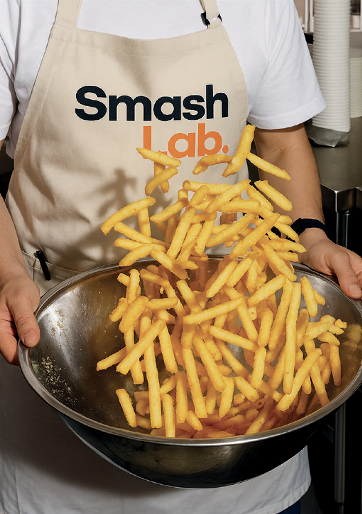
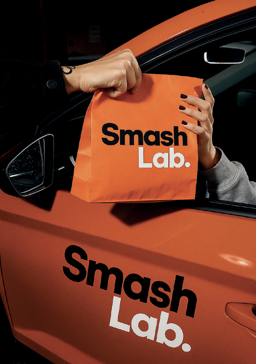
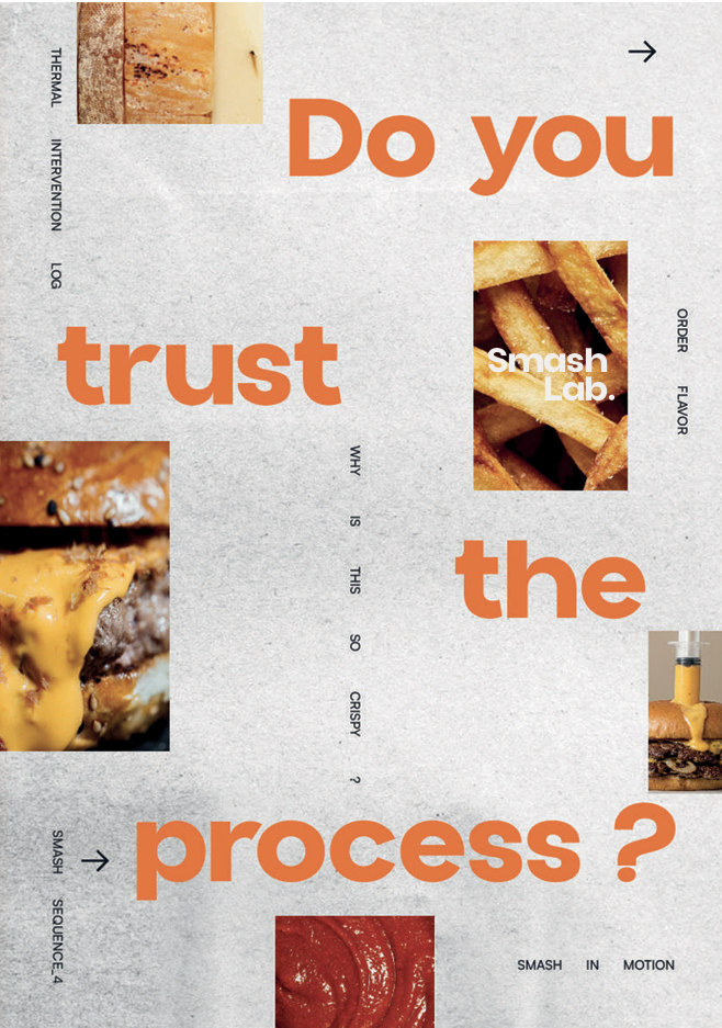
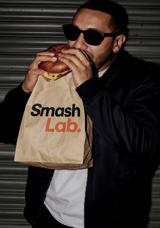
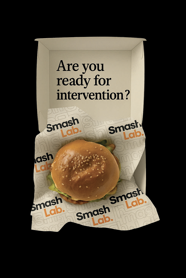
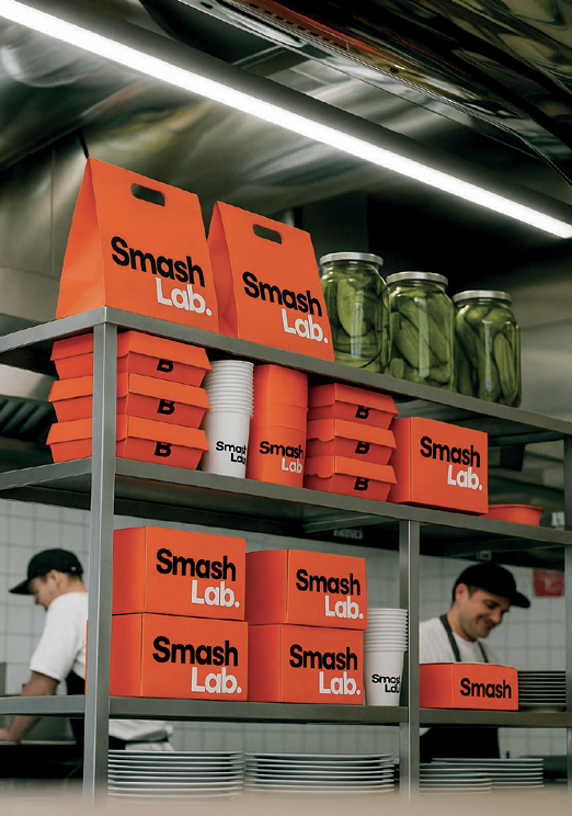
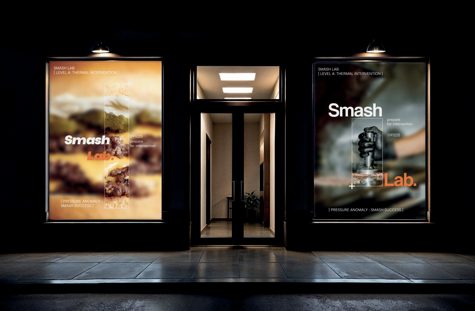
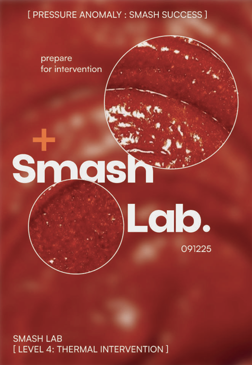
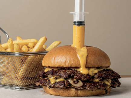
From the "cheddar syringe" ritual to the typographic warnings, every touchpoint at Smash Lab is engineered. The design language borrows from computer systems-using "error messages" and raw data aesthetics to gamify the dining experience. We utilized a stark Black & Orange palette not just for visibility, but to trigger specific psychological cues: Black for technical mastery, Orange for immediate appetite and heat. It is a brand that doesn't just feed you; it processes you through a system of flavor.